


Design of a banking app so that it is effortless for the clients to make transactions. Bankley is a modern, fresh banking experience, aimed at early thirties tech consumers. They would like a seamless cross-platform experience that helps their clients feel as secure on mobile as they do on the desktop.
Design a new user interface that you think best facilitates transactions. You should design the interface across various devices and adapt the experience accordingly.


Review of existing research: 2 weeks*
Competitor audit of 2 local banks: 2 days
Design brainstorming and iterations: 2 weeks
Heuristic review of the new design: 1 week
In-person usability testing: 2 weeks
Recommendations and next steps: 1 week
____
I am unable to share the design specifics of the project due to a non-disclosure agreement with the DXD team. However, I can outline my design process and contributions across different phases:
UX/UI Designer — Sole designer from concept to delivery. Responsibilities: UX research & personas. Competitive audit. Wireframes & prototypes. Usability testing. Accessibility design. Responsive layout strategy. Visual design system, Information architecture.
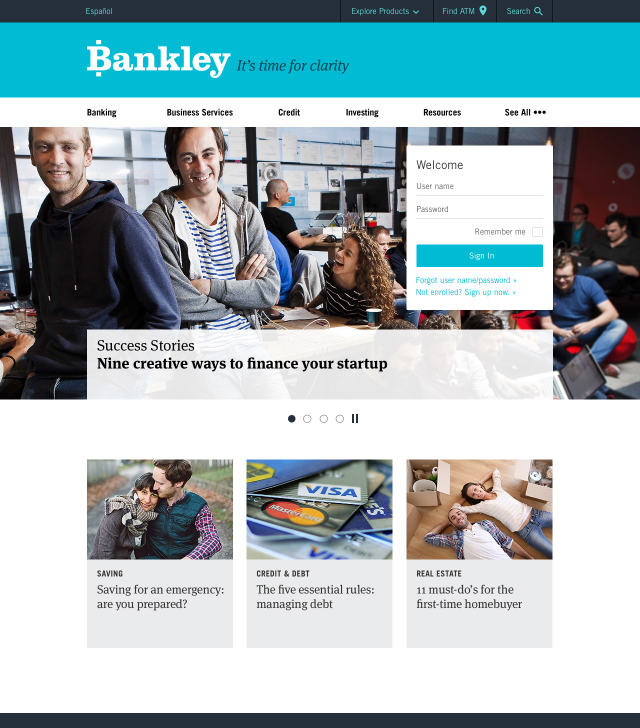
Younger users often find traditional banking websites overwhelming, outdated, or unclear. Bankley needed a user-first, streamlined experience that would attract tech-savvy audiences while maintaining credibility and compliance.
Create a responsive banking website that: Makes account creation and navigation easy. Supports multilingual users. Builds trust through a modern, consistent brand. Is mobile-optimized and accessible across devices.
I interviewed six users across three main demographics: students, freelancers, and small business owners. Common themes included: Frustration with dense layouts. Desire for quick mobile interactions. Need for transparency and education.

AGE: 18
OCCUPATION:
High school senior
LOCATION:
Blacksburg, VA
STATUS:
Comfortable using mobile apps and online services
"I just need a simple app to manage my allowance and part-time job earnings, and I want to feel confident I'm doing things right."
Alex, the first-time account holder, is a student who prioritizes convenience, simplicity, and security when selecting a banking app. The user needs an app that simplifies managing finances and provides the necessary tools and information to navigate banking confidently.
Needs a quick, straightforward, and clear onboarding process to open their first bank account. Requires an app that allows them to check balances, transfer money, and make payments easily from their phone.
Financial Education: May need guidance on managing money and understanding banking concepts. Wants to complete tasks efficiently without unnecessary delays or complexities. Needs a secure platform that protects their financial information and instills confidence.
A complicated account setup process can lead to frustration and abandonment. Overcrowded interfaces or complex navigation can hinder access to important features. Advanced features not relevant to their current needs can be overwhelming.

AGE: 35
OCCUPATION:
Bilingual Entrepreneur
LOCATION:
Bangor, ME
STATUS:
Managing her business
“As a busy entrepreneur, I need to manage finances efficiently, so user-friendly online and mobile banking platforms are essential.”
Maria needs to manage her finances from anywhere, at any time, using her mobile device. Maria values quick and easy ways to perform common banking tasks, like checking balances, making transfers, and paying bills. As a bilingual entrepreneur, she needs a banking app that caters to her language preferences and offers clear support in both English and Spanish.
To be able to constantly monitor income and expenses.
To be able to quickly manage financial flows.
Maria needs a clear overview of her business and personal finances, ideally separated for tax purposes and profitability tracking.
Maria needs a clear overview of her business and personal finances, ideally separated for tax purposes and profitability tracking.
Maria is on her way to a client meeting and needs to quickly check her business account balance before confirming a payment.

Maria opens the banking app and quickly logs in, potentially using biometric identification for speed.

She navigates to the account overview, where she can easily switch between her personal and business accounts.

The dashboard shows her business account balance clearly and provides options to quickly view recent transactions

Maria can easily switch the app's language to Spanish for better understanding.
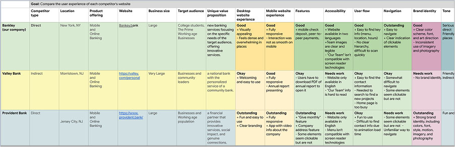
I analyzed Valley Bank and Provident Bank to identify UX and branding gaps: Competitors had dense interfaces and inconsistent mobile flows. Accessibility was often overlooked. Strong brand identity made a big difference (Provident was a standout here). These insights guided Bankley's strategy: focus on clarity, accessibility, and seamless responsiveness.
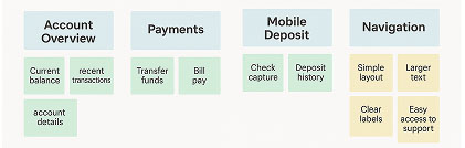
Conducted a brief analysis to address the gaps identified in the competitive audit. My goal was to present a complete overview of the actions taken by potential customers and their step-by-step decision making.
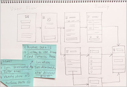
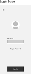
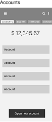
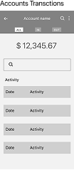
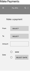
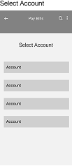
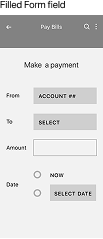
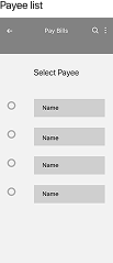
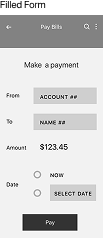
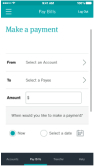
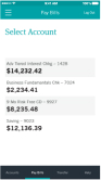
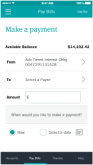
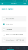
Created wireframes for login, password recovery, dashboard, and bill payment flows. Covered key steps like payee selection, scheduling, and confirmation. These helped validate task flows early and informed the final design.
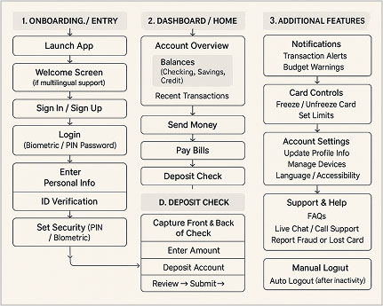
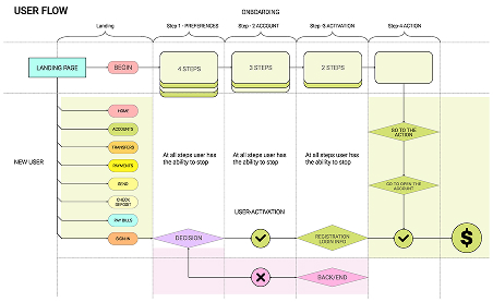
This high-level flow maps the key user actions from onboarding to core banking tasks and support features. I led the user flow research by analyzing user needs, identifying friction points, and aligning insights with business goals. The result informed UX design decisions, streamlined navigation, and improved user experience across the app.

I have enhanced the registration process for new users, making it more intuitive and user-friendly. The call-to-action (CTA) is now visually striking and clearly guides users to the next steps, resulting in a 19% increase in the usability of primary actions for a smoother experience.
A/B testing. User feedback: I conducted data collection through interviews to identify pain points and areas for improvement. I used analytics tools to evaluate the onboarding process and make informed optimization decisions.
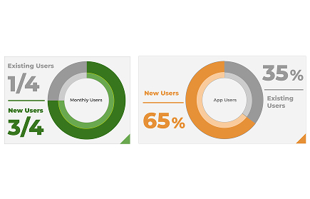
Why we have to think about a New User? We should enhance the experience for new users, who engage more frequently. With one-third of new users interacting monthly and making up 65% of our user base, focusing on their needs can help improve retention.
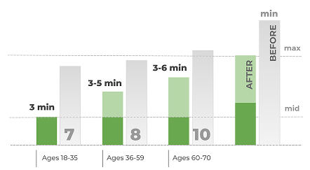
I conducted a remote, unmoderated usability test with 5 participants. Key takeaways: Users struggled to locate the "Open Account" action — it needed more visibility. Participants appreciated the clean design and mobile layout. Bilingual toggles and founder/team info built trust.
Streamlined homepage. Simplified tab navigation. Refined color palette and imagery for brand consistency improved screen reader compatibility. High-contrast design for readability. Responsive Design.
Designing for fintech audiences requires more than just clean visuals — it demands empathy, transparency, and clear guidance. Grounding the process in research and real user feedback helped ensure Bankley digital experience was both effective and human-centered. Collaborating within cross-functional team in a DXD company. How to communicate actionable and testable user insights to the team. Working with limitations and constraints you have. Understanding user mental model - asking right questions to elicit honest feedback. Keep testing on different stages of process with real users.
